Framing
I followed this rule pretty well because of the way his head fits on the computer screen as if it is framed.
The subject is his head in front of the computer monitor.
It should be clear that this is framing because of how obvious the frame is around his head.
I could have gotten a closer shot to better define the frame.
Simplicity
I followed this rule pretty well because of the simple phone on the table.
The subject is the phone on the plain white table.
The phone is the only thing you see so the subject is very clear.
I could have moved the computer mouse wire away to make the phone the only thing in the whole picture.
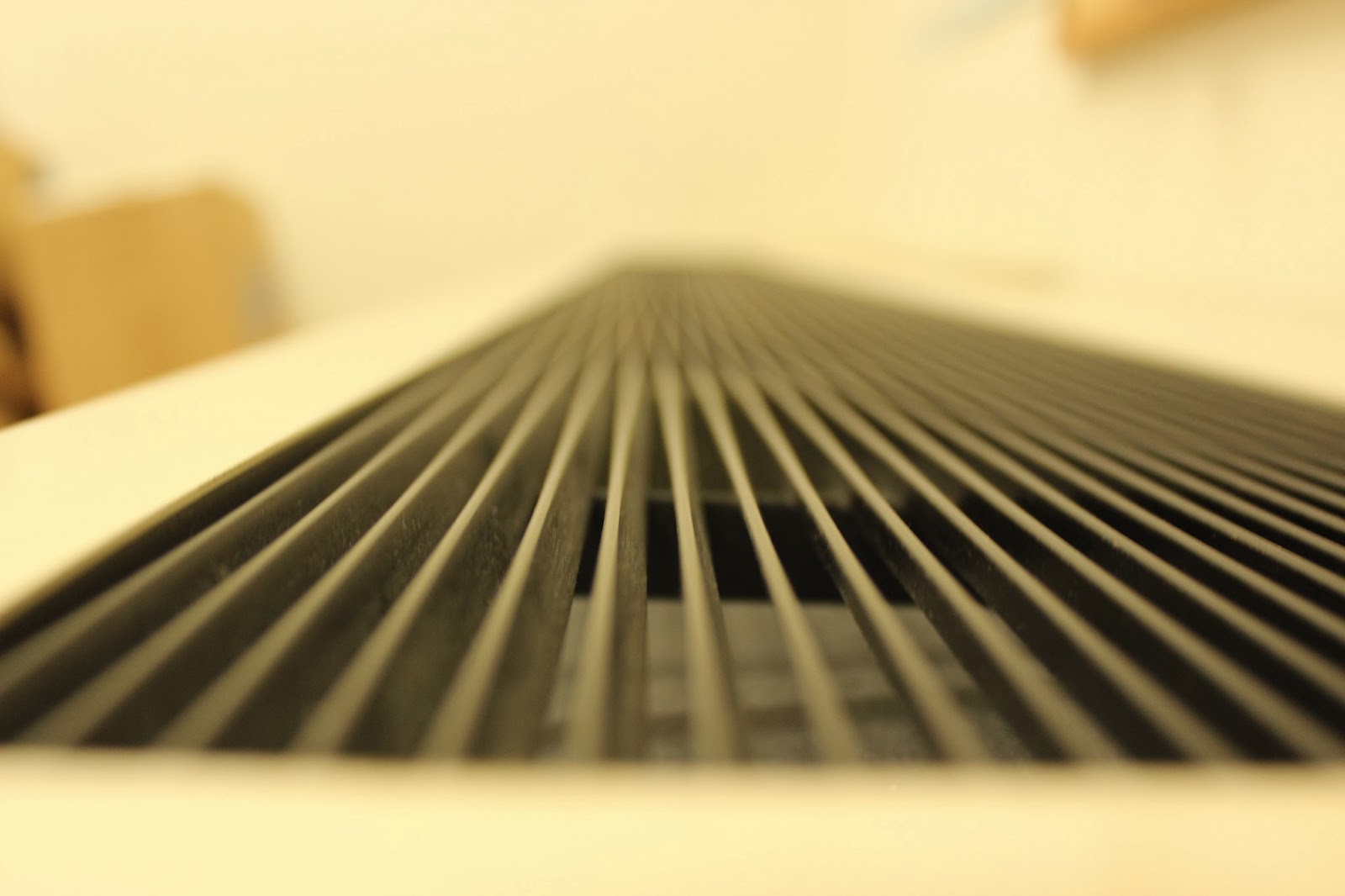
Lines
I followed this rule perfectly because of the lines on the Air Conditioner were the perfect example of lines.
The subject is the lines on the AC.
The lines really pop out and its the first thing you see so the subject should be easily seen.
I could have focused a little more to get a clear shot of the lines.
Rule of Thirds
I followed this rule very well because of the way I took the picture of the sphere in a very good position for rule of thirds.
The subject is the sphere in the corner.
The sphere is clearly in one of the corners of the image which guides the viewers attention to that corner.
I could have chosen another sphere with less things in the center to better capture the attention to the top right corner.
Balance
I followed this rule pretty well because of the amount of computers and desks on both sides.
The subject is the way the classroom is organized and how the sides balance each other out.
The computers and desks are the first thing you see so you can clearly see how its balanced.
I could have asked the girl to move from the center so I could get an even better example of balance.
Avoiding Mergers
I followed this rule pretty well because of the way I avoided taking the picture of his shirt combined with the red poster in the background.
The subject is shown sitting down working on his computer but the poster in the background matches his shirt, this is where I had to move at a better angle to avoid mixing them together.
I could have tried to focus on the poster a bit more to really show the how similar the colors are.


